Back to Robin’s nest

Robin Mientjes,


Versatile


Designer

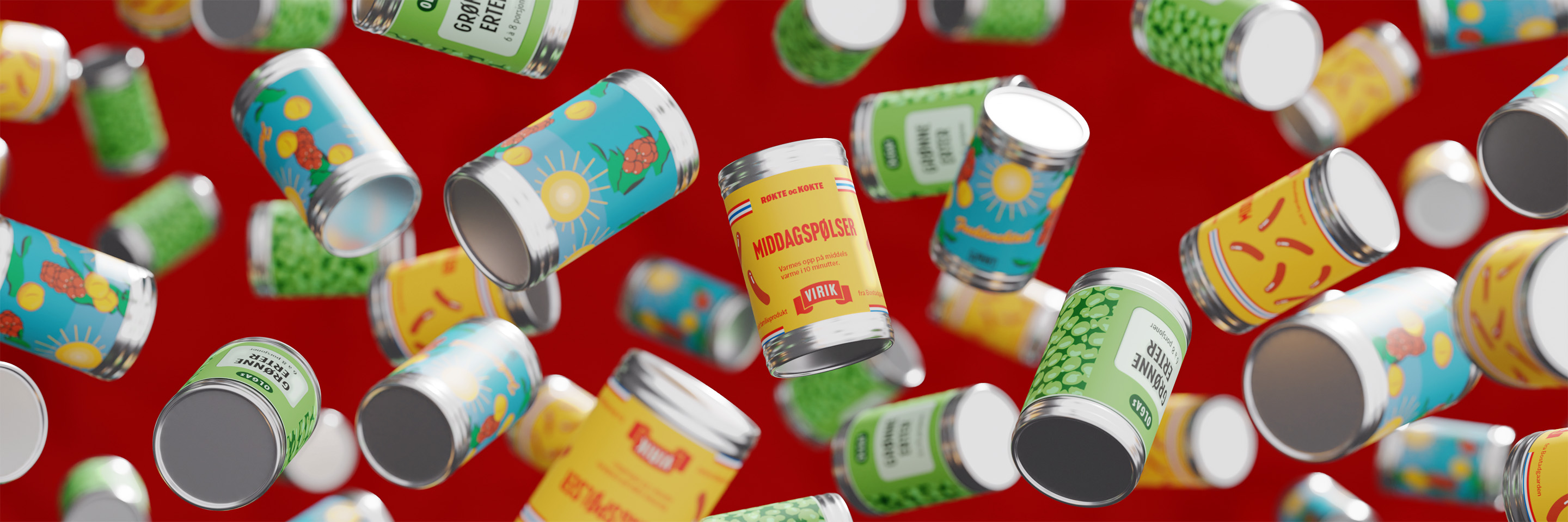
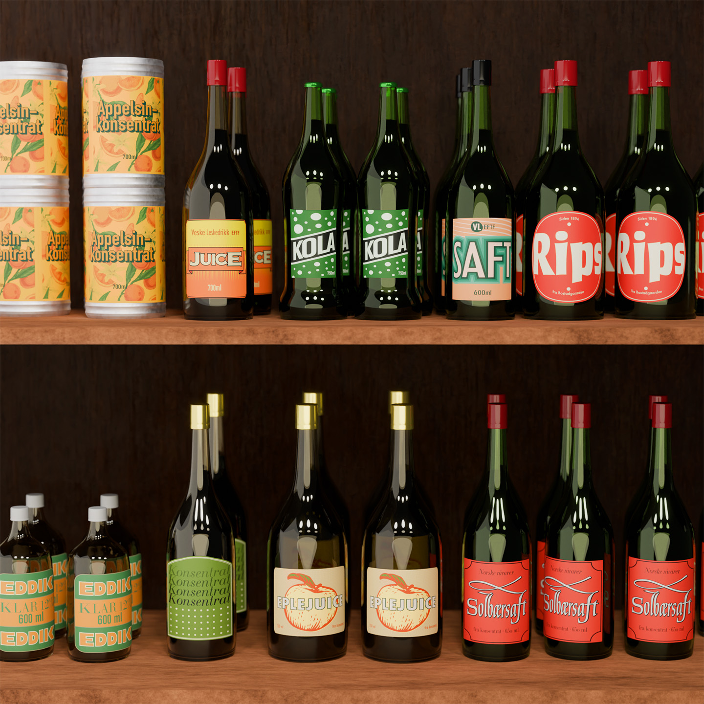
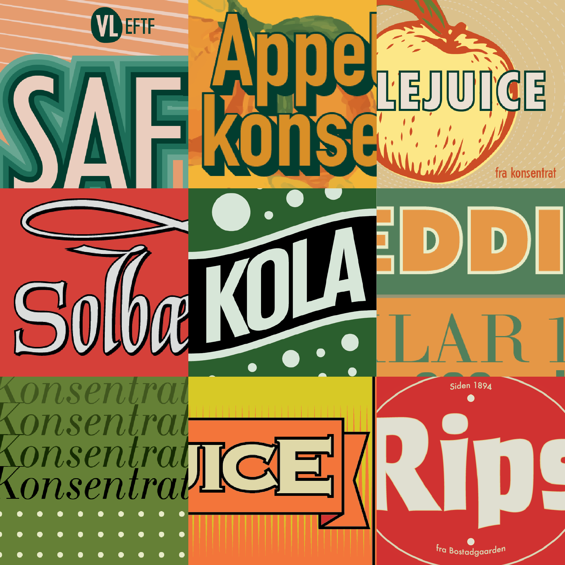
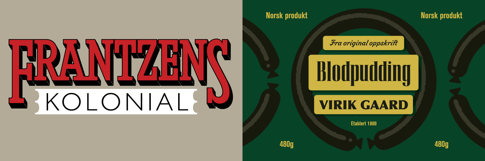
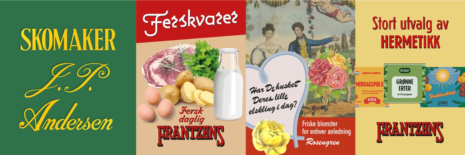
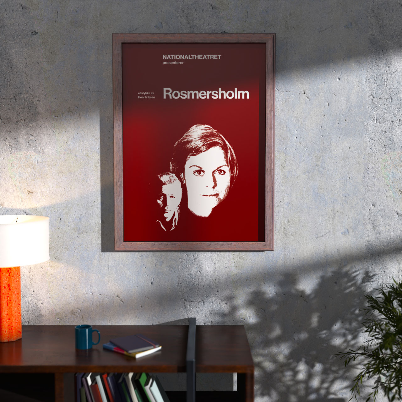
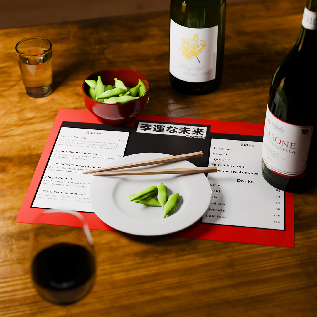
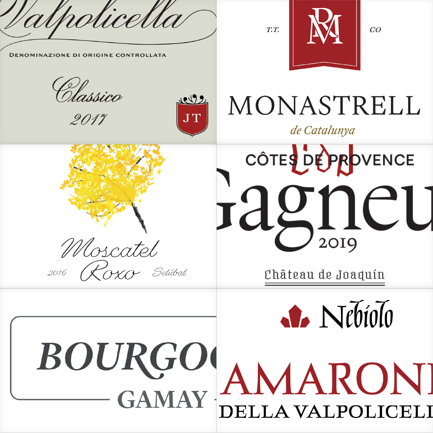
Den Første Julen i Skomakergata

The Norwegian Christmas movie of 2023 is a prequel to a beloved children's tv series, and I designed a wide range of props, packaging, logos and some small objects for it.
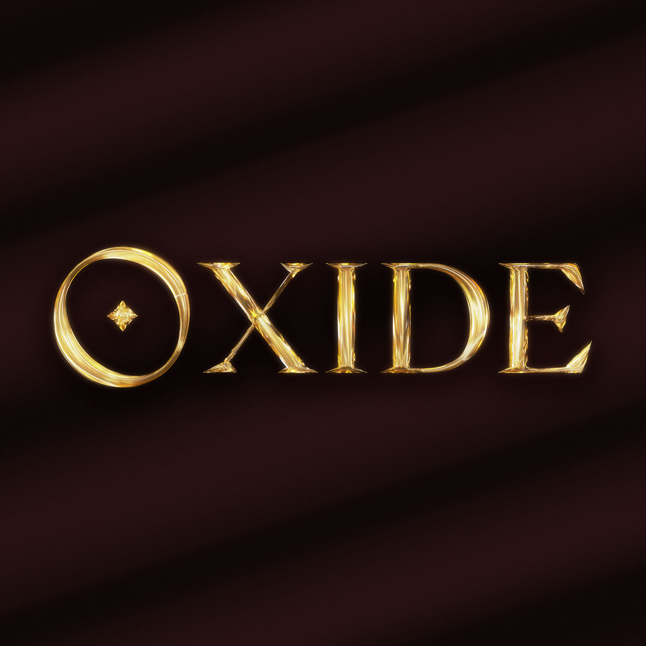
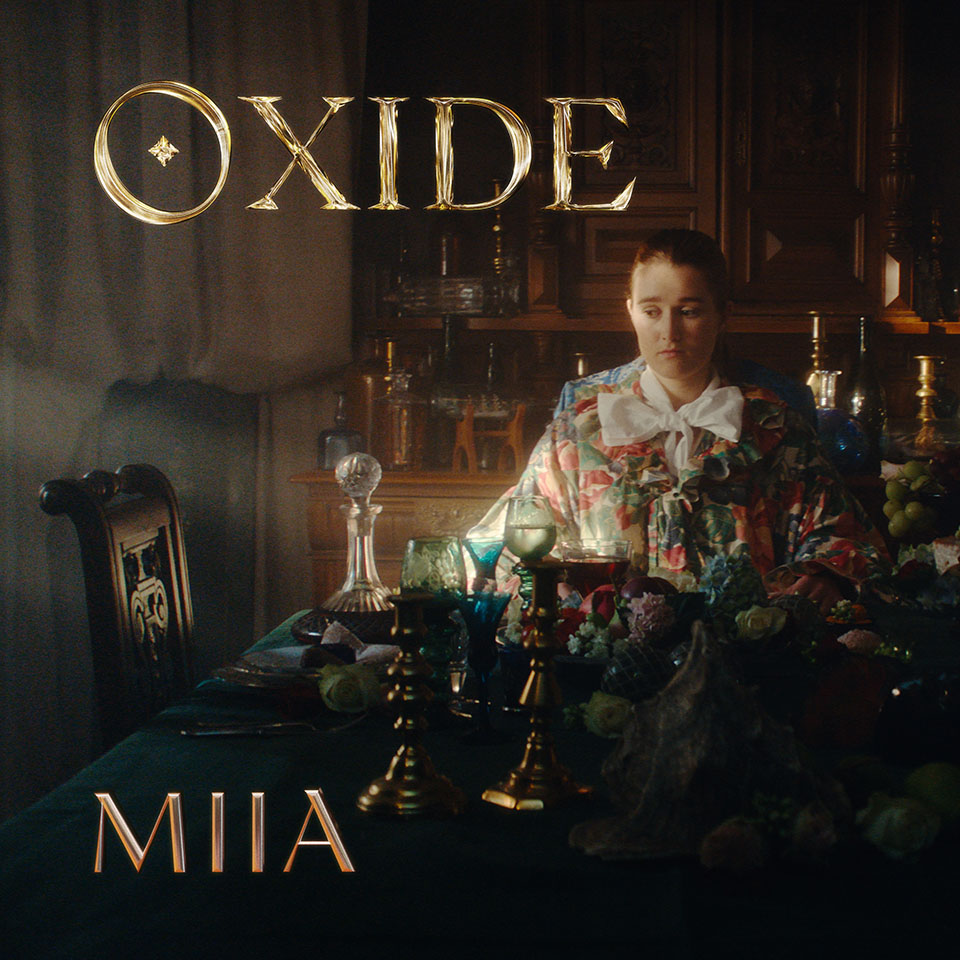
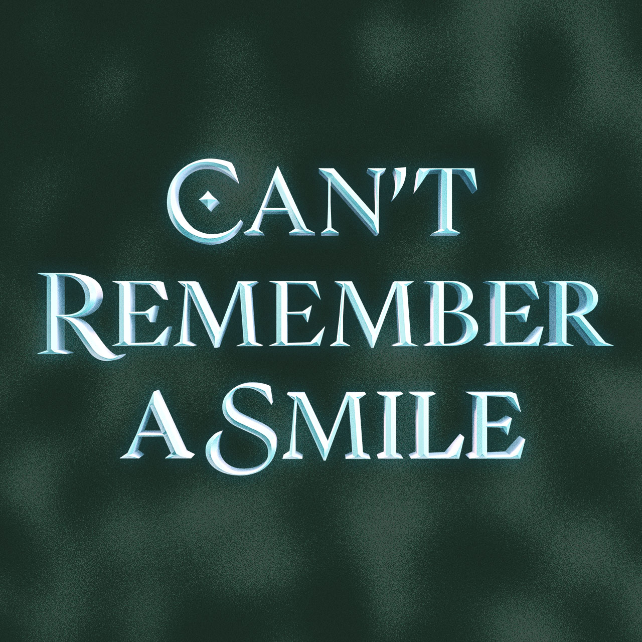
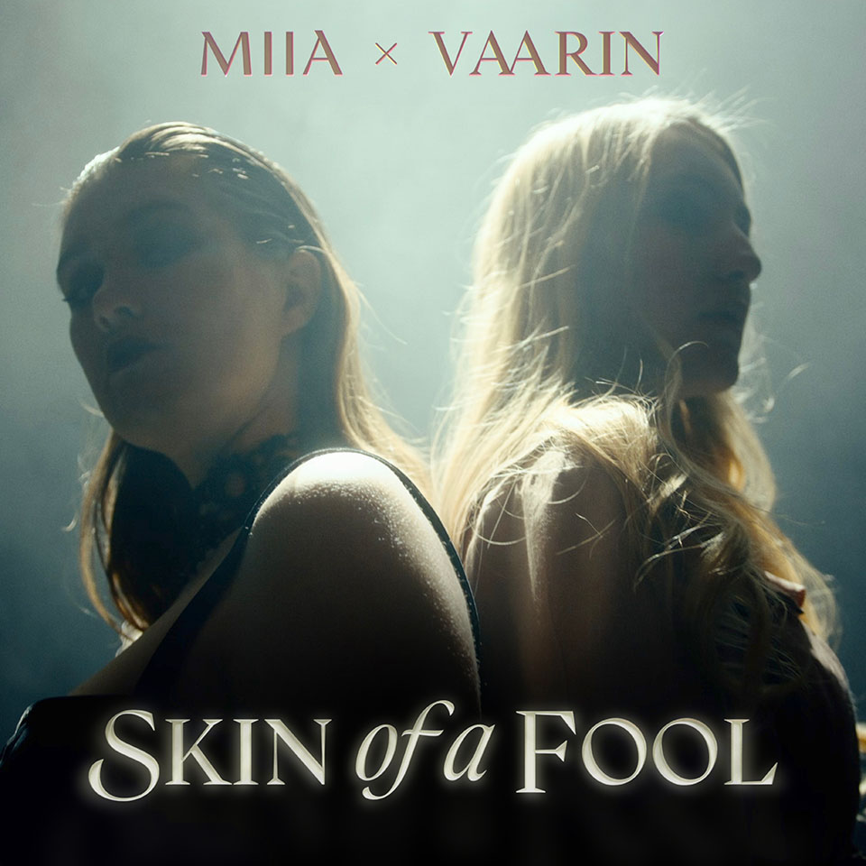
MIIA

Musician MIIA released four music videos simultaneously, as part of her new EP. She wanted titles that would tie together her visual identity and her musical story.

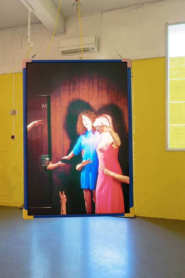
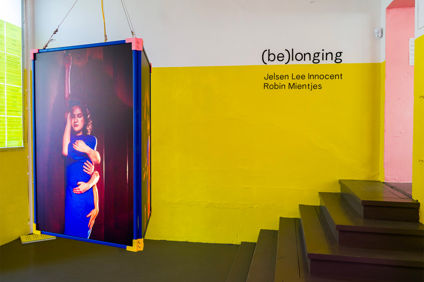
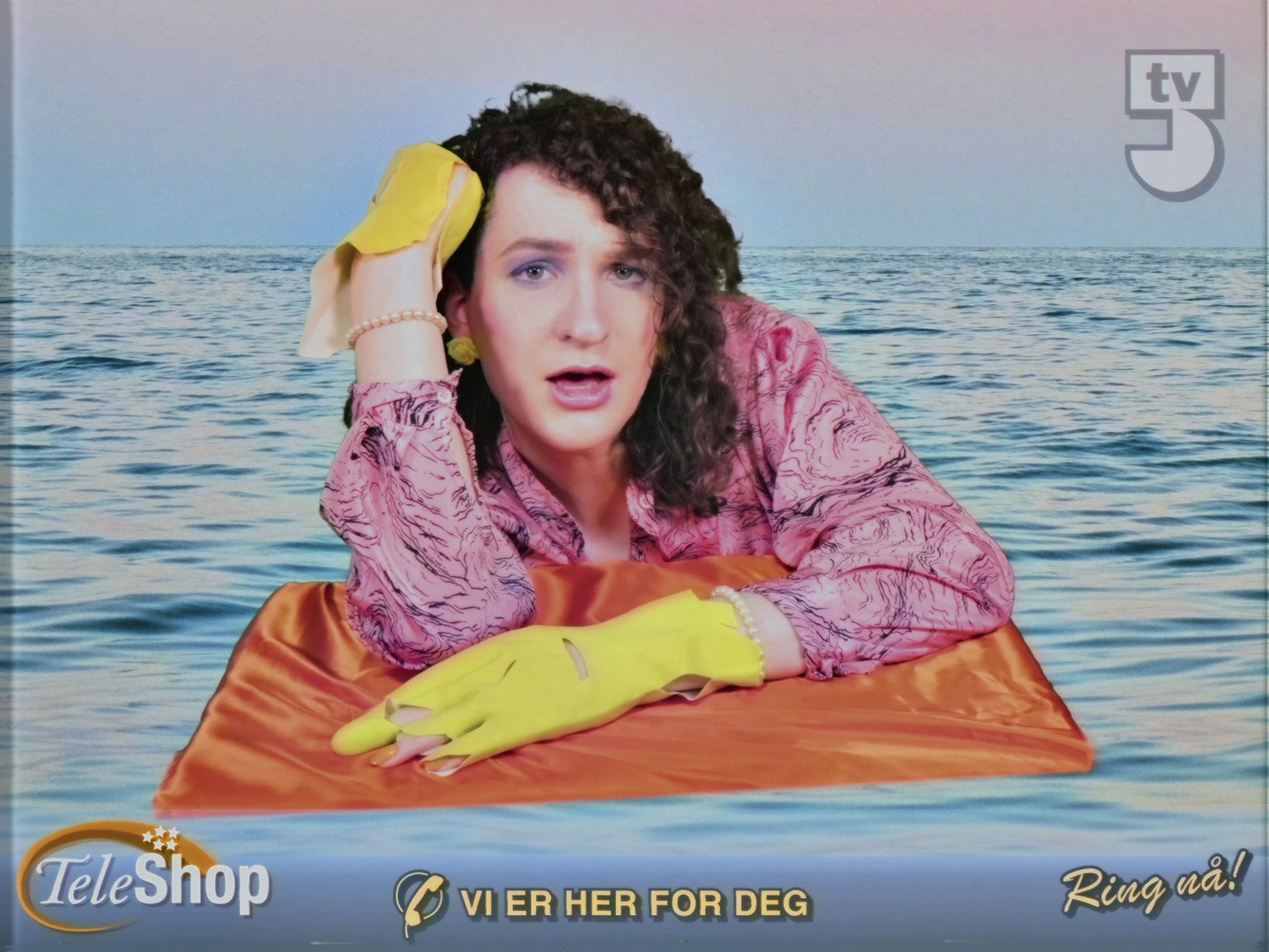
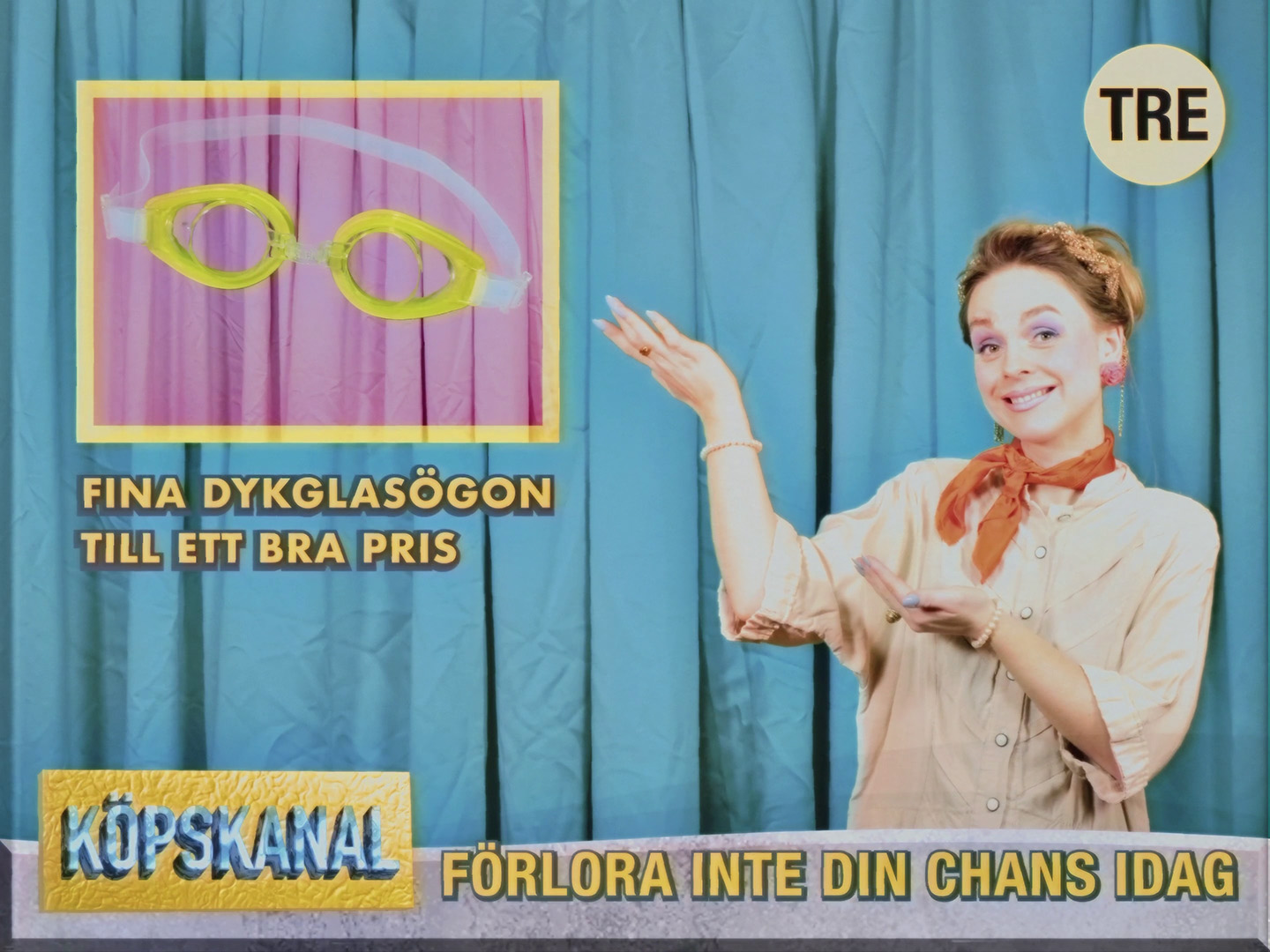
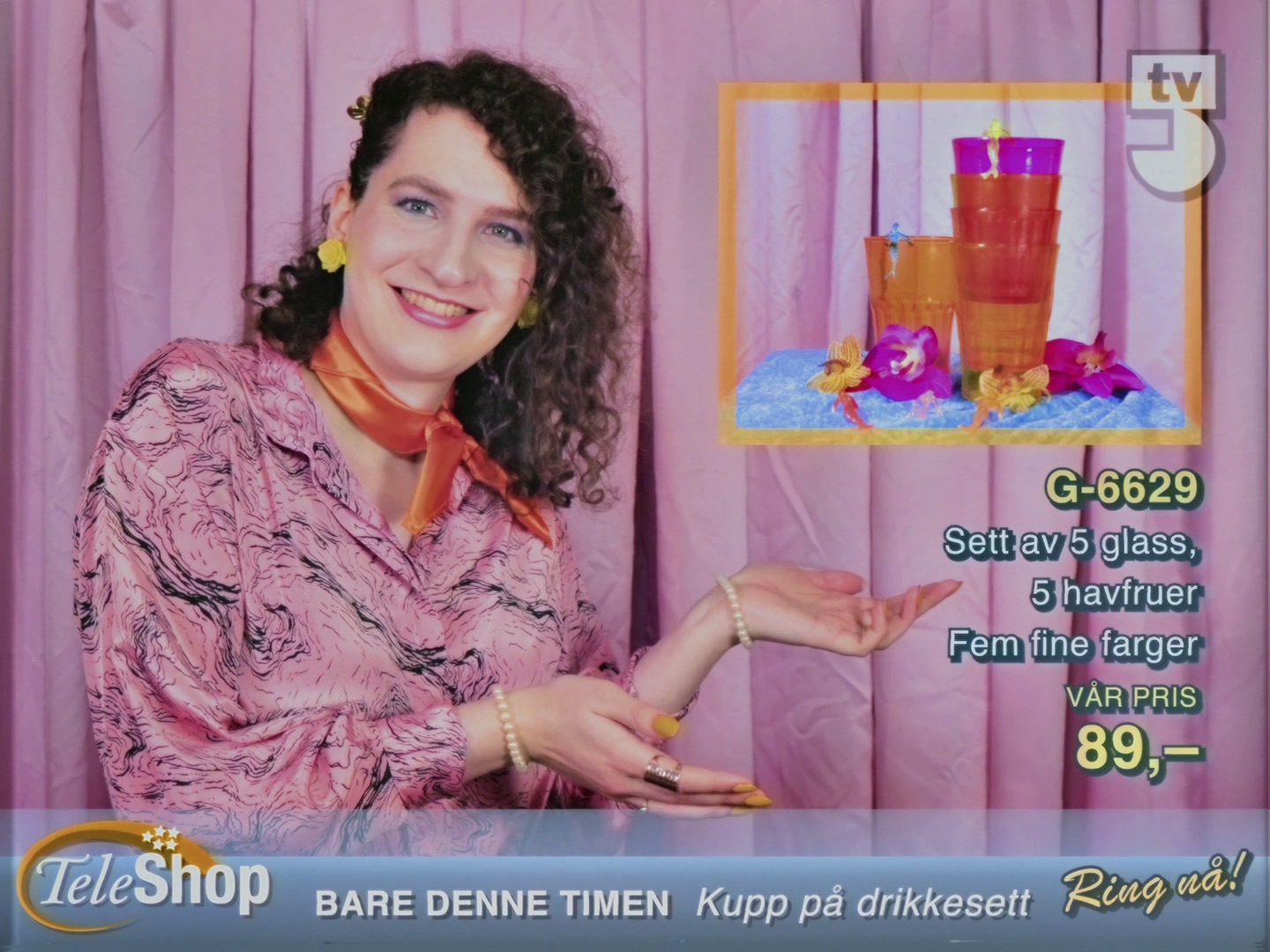
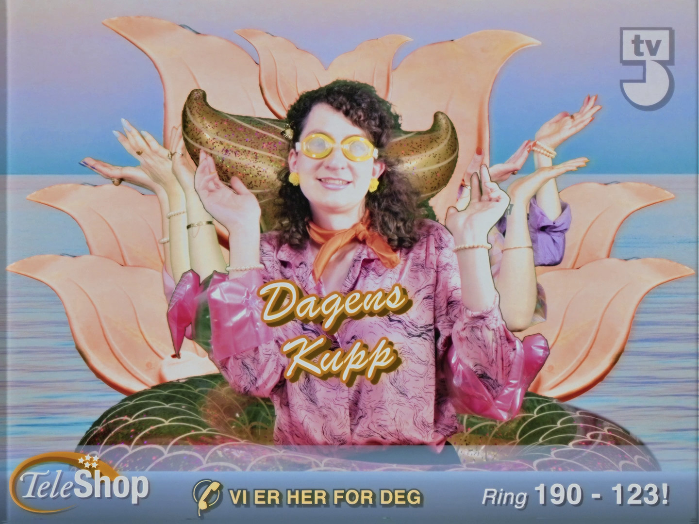
The things I’m afraid to ask for

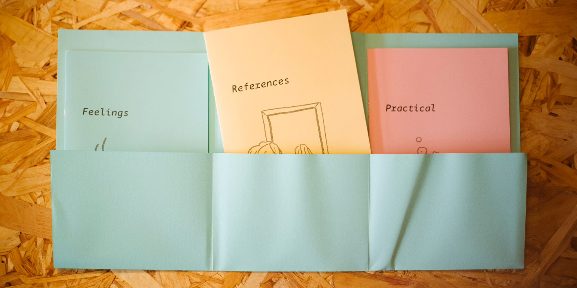
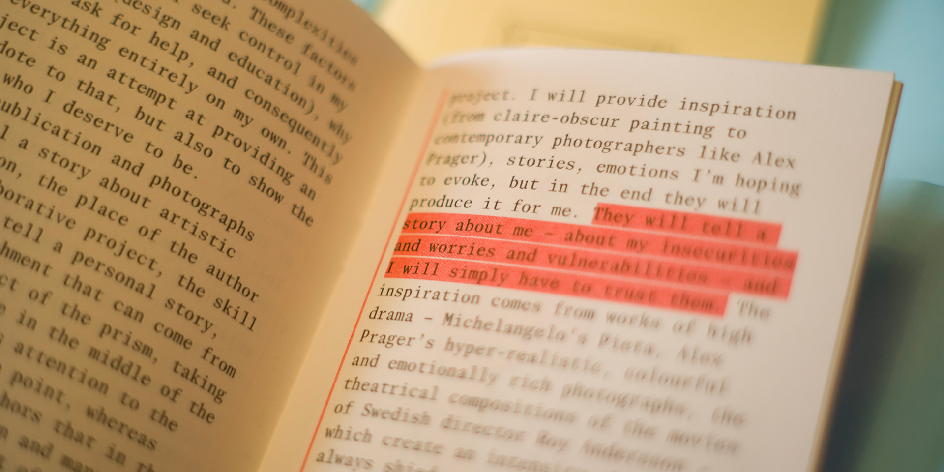
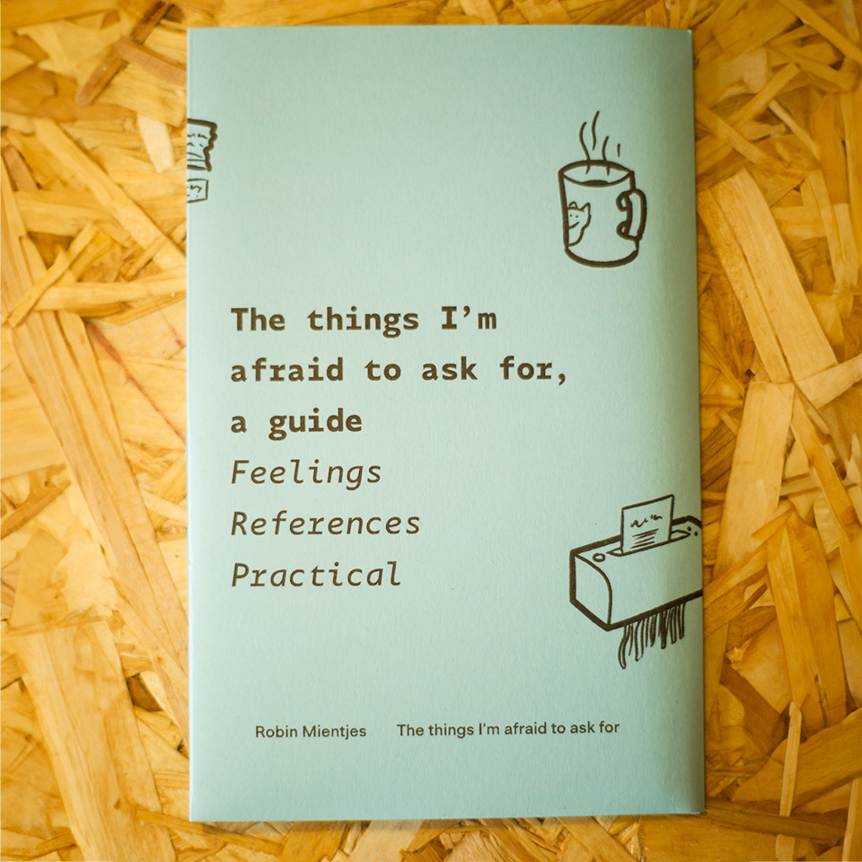
As part of a year-long exhibition, I created a floating art piece and wrote and designed a short publication about the process of making art – the feelings, references, and practical issues around it.

A large lightbox in the shape of a prism, suspended from the ceiling. The three sides of the prism show three different photographs. The same prism-shaped lightbox as above, showing another angle. The three-part publication, displayed inside its poster. A detail photo of the inside of the Practical booklet. The entire publication, poster and three booklets, folded into one compact set.

Må jeg alltid bære min egen kropp – Gaspard

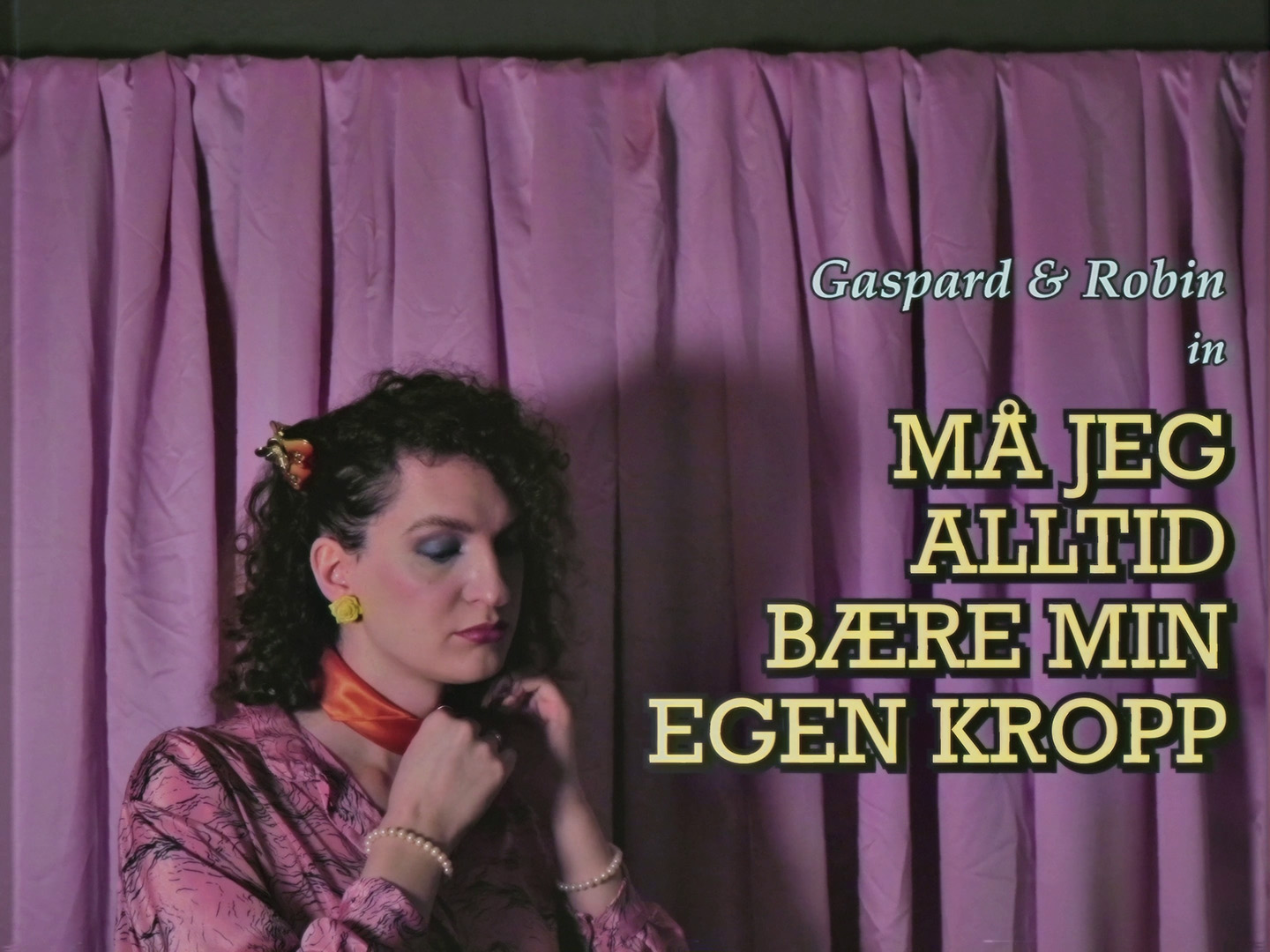
I designed on-screen graphics, titles and some visual effects for the music video for “Må jeg alltid bære min egen kropp”, by Gaspard. Design and direction by Hedda Virik.

XXX XXX XXX XXX XXX

The Worst Person in the World

Graphics and props for an Oscar-nominated movie about a woman unsure of her identity as she puzzles her way through life across interests intellectual and romantic.
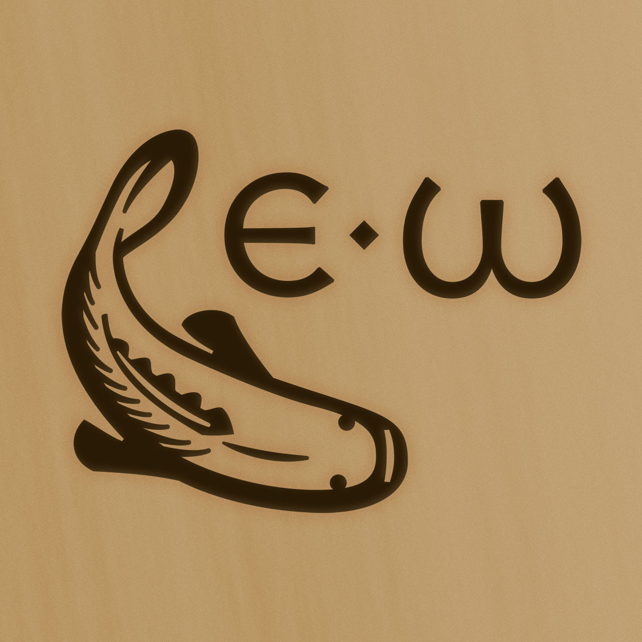
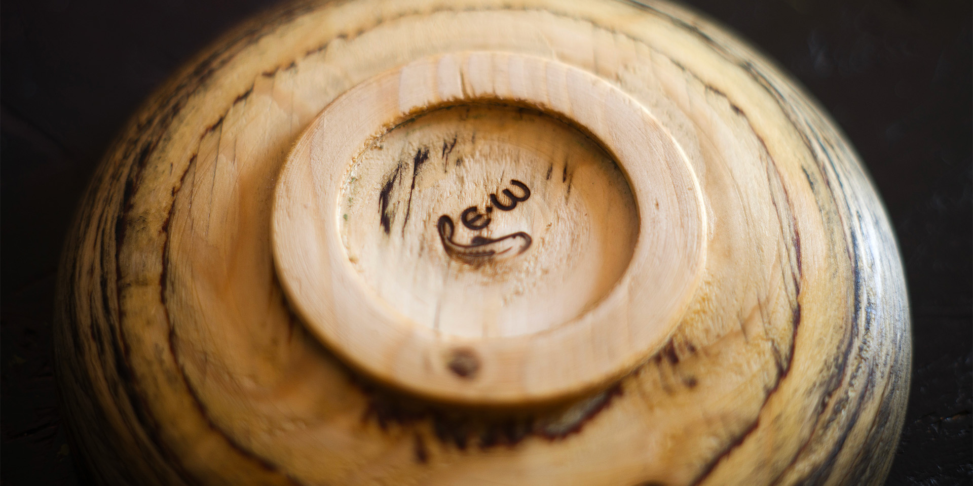
A fake poster for a National Theatre play from the 1960s, in bright red. It serves as a reminder of the main character’s mother’s career, and her own struggles to establish one. A deleted scene in an izakaya needed a menu, a social menu for social food. A range of fake wine labels. Norwegian alcohol law prohibits the promotion of alcohol, so movies generally need fake wine. But fake wine still needs to look real. Close-ups of six different wine bottle designs.

Eric Williams

Eric Williams is a woodworker, among many things, and every woodworker deserves a true brand. So this isn’t simply a logo – it’s a true brand, burned into every piece he sells.
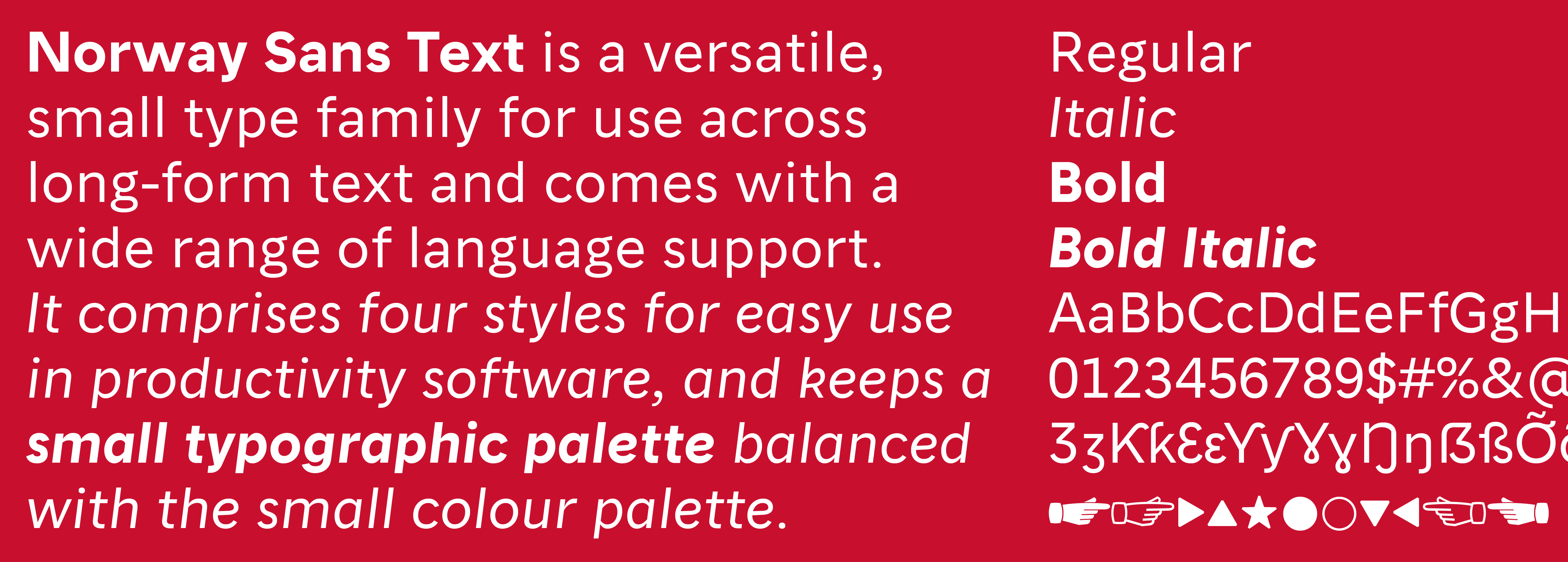
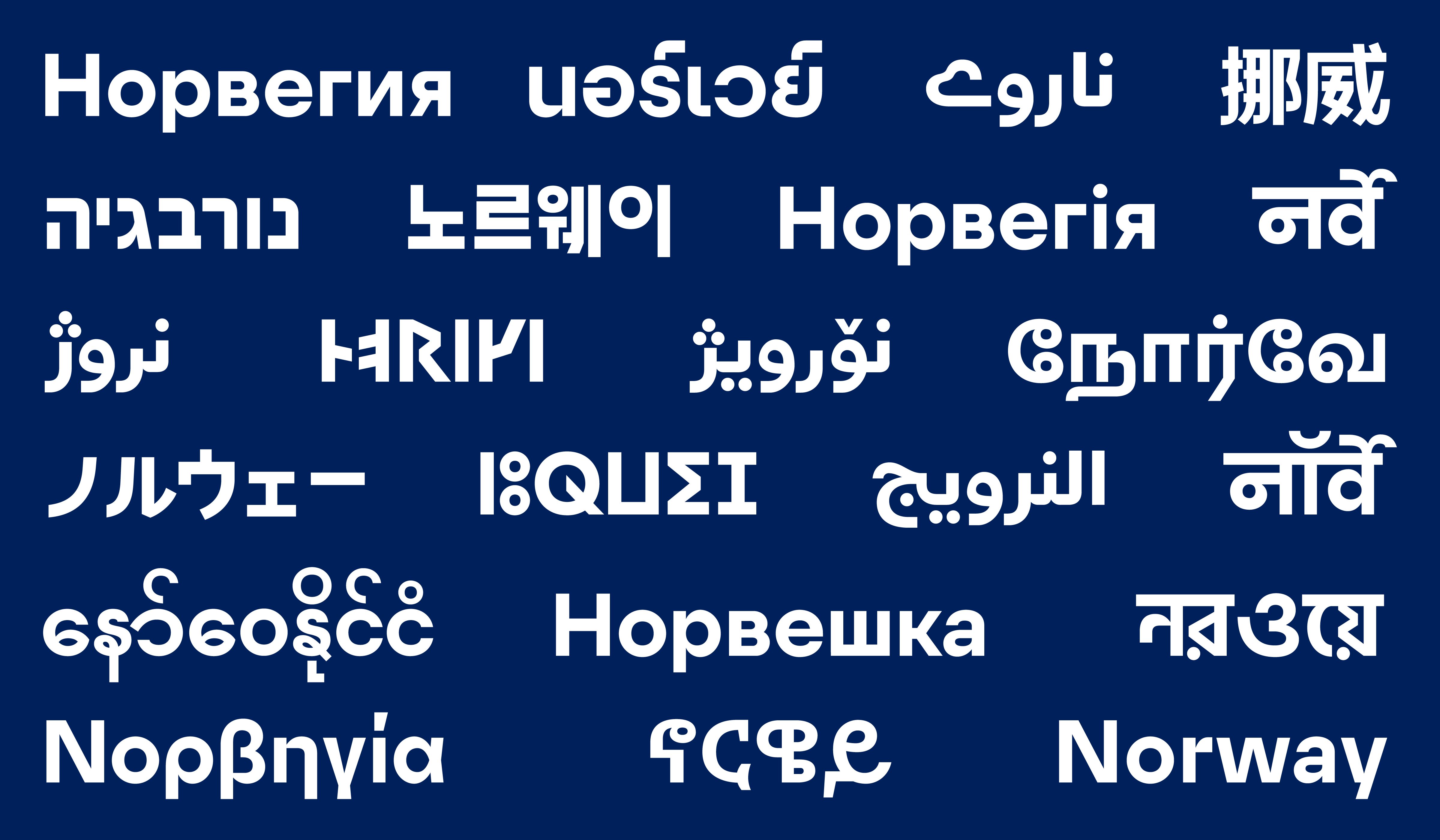
Eric Williams’s logo, an E-W monogram in a handcarved style, seated next to an illustration of an Atlantic Grouper, in leisurely posture. The logo burned into the base of a plate.

Brand Norway

We were commissioned to help promote Norway across the world, for business and tourism purposes. I worked with a core team to develop a small, pragmatic set of typefaces to not only provide identity, but also a reliable tool for non-designers.
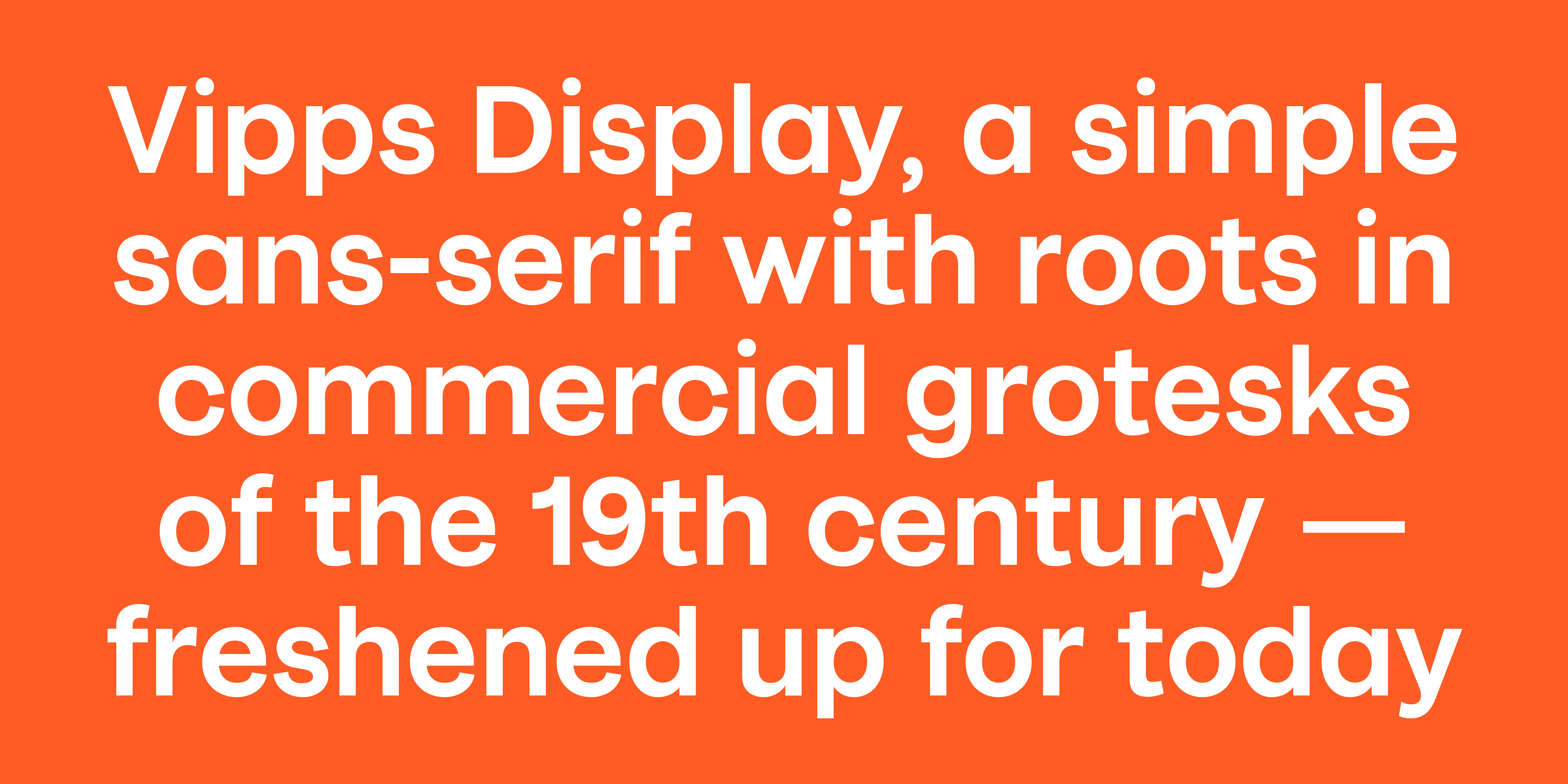
Norway Sans Display is a geometric sans-serif for big, big use across the whole wide world. It has sharp horizontal and vertical cuts mixed with circular curves and a classic proportion. Norway Sans Text is a more gentle, open sans-serif for small and long-form use across media and user platforms. It provides the core typographic set of Regular, Italic, Bold and Bold Italic, which simplifies the visual language and keeps all typographic choices accessible to people working with any types of applications. As a global communication and diplomatic effort, the logo should speak the local language. I drew localised logos for all the countries Norway has diplomatic relations with.

Vipps

Vipps is the biggest P2P payment platform in Norway, used by more than 75% of the country. We transformed them from a tired banking experience into a fresh and casual person-to-person app.

The full range of fifteen ‘emoji logos’, variants used for playful animations and tongue-in-cheek situations. Vipps Display, a simple sans-serif based on 19th century merchants’ grotesks, with a friendly proportion and a few distinctive curves that make it feel fresh and modern. Details such as angled terminals, relatively high contrast, and very closed form, all in the service of an exaggerated roundness. Vipps Text, a text- and interface-focused style that is a bit more even-keeled than the display style.

Semper Fi

Semper Fi is a short film about the unpredictable and complicated nature of war, and being a soldier. Some return as heroes, some return as monsters. I designed titles and credits.
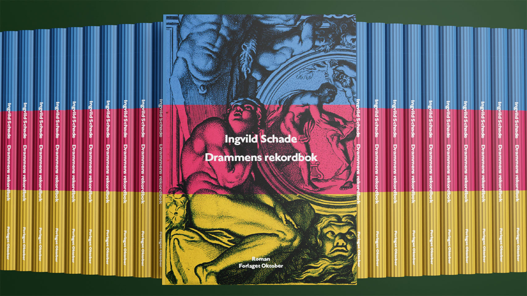
Drammens rekordbok

Drammens rekordbok is a novel about lots of complicated, weird, bad, interesting and – in their own opinions – normal people. The cover evokes marbles as the art form of recording meaningful events for posterity.